Myth vs. Truth: eAccessibility

It’s that time of year again! Spring is when the Accessibility Network runs its creative campaigns aimed at boosting awareness of electronic accessibility and its techniques. This year’s campaign theme was Myth vs. Truth.

The campaign consisted of digital screens displayed during spring semester at main campus as well as the branch campuses. I also designed a poster:

eAccessibility poster Myth vs. Truth

The poster was sent to our Accessibility Liaison group participants as well as displayed university-wide by key champions and communicators throughout out network. One division liked it so much they enlarged it to poster size! We also re-designed it for another college to fit on their horizontal bulletin board.

eAccessibility poster Myth vs. Truth (wide)

Newsletter Strategy

o365-02

Excerpt from the last O365 email migration newsletter letting people know what resources they needed to successfully migrate their transition. View a larger version of the full newsletter.

With a university-wide rollout of Office 365, communication about the project was more important than ever. Not only was this change going to have an effect on email–the lifeline for communication at the university–but it was going to impact every single faculty and staff member. IT leadership requested an email notification; we gave them a designed weekly email update.

Finally, we were receiving positive feedback about our transparency and proactive communications. This newsletter was sent out from the IT@UC Help Desk every Wednesday notifying everyone of the project’s progress, what needed to be done before the migration, and available assistance after the migration.

As long as the project was sweeping through the university, our newsletter let them know all they needed to know.

As the O365 email migration portion of the project simmered down, a weekly email became unnecessary. But, we realized the need for transparent proactive communications was still not being met. Based on the success of the O365 newsletter, I formed a newsletter strategy that would meet these needs.

newsletter-outline

The idea was to phase out the weekly divisional email and create a new mid-monthly email in its place. This newsletter, the IT Insider, would update all central and divisional IT personnel about the projects currently impacting the university. Anyone can opt-in to this newsletter.

it-insider

An excerpt from the monthly IT Insider email newsletter. This newsletter keeps central and distributed IT abreast of what projects are going on in the division. View a larger version of the IT Insider newsletter.

So far, we’ve had good success with our newsletters with a 48.5% open rate (industry standard is ~25%) and 14.1% click rate (industry standard is ~5% click rate) in the second month.

Additionally, for central IT personnel, the IT Staff Council publishes a beginning of the month email. This newsletter fosters the “culture” of the division, highlighting divisional events, kudos, anniversaries, birthdays, and accomplishments. This, too, has had decent stats with ~47% open rate and 9% click rate.

Lastly, once a semester, the division will post a UC News article letting the university know about its accomplishments in relation to the university strategic direction.

All of these newsletters relate to our public website as well as keep in mind that a university-wide intranet is under development. As new channels for internal communication at the university arise, this strategy creates the framework for building upon good client communication moving forward.

Can You Hear Me Campaign

The beginning of spring semester is another great time to catch faculty and staff before the heavy lifting of the semester starts. This year, the awareness campaign consisted of a silent video, bringing awareness to closed captioning, along with four companion posters, each drawing attention to a simple accessibility technique. The idea was to quickly catch the audience’s attention and draw them to the Accessibility Network website.

This silent video was created to play on various digital screens across campus, but mainly the screens in the student center. The hope was to increase awareness of captioning in the student body, drive demand for the use of videos with captioning and, in turn, cause faculty to learn more about the technique.

student-center

Can You Hear Me video playing on the large video wall in the student center.

We hung the four companion posters in various buildings around campus:

Each poster incorporated tearaway strips, so if the viewers wished to find more information, they could take the web address with them.

As far as metrics go, we saw a small increase in web traffic right after the campaign was released and we continue to see more visitors to the site than when it was first released in August. We hope that come fall, the idea of accessibility will at least be a somewhat familiar topic to the faculty and staff through this spring campaign.

Start Small Campaign

The start of a new school year for the Accessibility Network brought the unveiling of a new campaign: Start Small. This is the idea that everyone can start incorporating accessibility techniques into their electronic materials by choosing one small way to begin. First, I updated the website and reorganized its content.

start-small

Next, I designed bookmarks to hand out at new faculty orientation. These, we hoped, would be a good resource on how to “start small” in daily activities. Each bookmark contains five ideas for each category on how to incorporate accessibility into electronic materials.

start-small-bookmarks

Four Bookmarks containing tips on how to incorporate accessibility into electronic materials.

For a larger accessible view, please take a look at the Start Small Bookmarks PDF.

Last, we printed handouts and a large poster of an accessible syllabus.

syllabus-expanded 01

Illustration of techniques on how to make a syllabus accessible.

For a larger accessible view, please reference the accessible syllabus PDF.

These materials were well received when new faculty stopped by our presentation table at the new faculty orientation.

2017-new-faculty-accessibility-01

Accessibility Website Refreshes

The Accessibility Network at UC website has undergone several refreshes while I have been the Communications and Engagement Coordinator. The first iteration was a one-page informational site to get basic information out there about our program. This worked for a while, but we quickly came to realize that our audience (faculty and staff at the university) wanted more than just who we were; they wanted tips and techniques about how to complete accessibility techniques.

The second revamp of the site included just that:

2017 Website Refresh-ex01

Website screen grab illustrating the first refresh of the site, organized based on audience.

As you can see, this was a 5 page microsite, containing info about the program, and resources based on our audience. This also worked for a while, but there were a couple of problems with the organization. First, we had trouble defining what students really needed to know about electronic accessibility. Though the creation of accessible electronic materials impacts them, they are not expected to use any techniques themselves–at least not currently. Organizing the information by audience only exacerbated this problem.

The second was that each resource page–student, faculty and staff–contained the same information on each, with the exception of a minor addition here and there. This resulted in our resource pages existing as very similar sources of information. Additionally, who really was to say that faculty did not need to know about accessibility for websites or that certain staff didn’t need to know about universal design for learning.

Both these downfalls made me want to organize the information in a different way–but how? I set off on a journey researching how other universities (and sometimes government sites) organized their content. I kept a spreadsheet of what I liked about each site and based our new site on everything that stood out to me as being the best.

start-small

The second website refresh, shown here with the second page highlighted. The content is now organized by type of material the audience wishes to remediate.

As you can see from the screen grab above, I decided to organize all content based on what type of material the viewer wished to learn about. This theme is reiterated throughout the site. The main categories down the left-hand side of the page–Electronic Files, Digital Course Content, Websites, and Software/Applications–all lead to a main page about the content and a checklist to include accessibility in that type of file. All pages push the viewer towards the Best Practices, Tutorials or Workshops page through the use of a left-hand callout box. And, as illustrated in the example above, there is ample use of links to more information.

The organization of the microsite now leads the audience to as little or as much information as they wish to investigate. The many links help to tell the story of accessibility in different ways, so the visitor can learn through methods they feel most comfortable. The site pages now follow a more universal design for learning approach and, hopefully, appeals to a broader range of audiences, instead of a select few. This also allows the site to reflect the very techniques the program wishes to see incorporated into all possible electronic materials.

Accessibility Network at UC

This past spring semester our program initiated a campus-wide contest urging university students, faculty and staff to submit their ideas for our new name. Our original name, the “Electronic and Information Technology Accessibility Program” was very long and unwieldy. It took about a month to plan and a couple of months to roll out, but we now have a new name we are proud of: The Accessibility Network at UC!

For anyone who’d like to take a look at the whole master plan, please read the PDF 2017_Naming Contest Post-Event Report. I will summarize the process in the remainder of this post.

Naming Contest-First Round-01j

Website homepage illustrating where viewers were pushed to during the campaign.

The objectives of the event were to: 1) Rename the program to more clearly reflect our objectives, 2) Shorten the name so it is easier to use in communications, 3) Promote awareness about the EIT Accessibility Program, 4) Promote awareness about eAccessibility and 5) Lay the groundwork for advocates for the program.

All advertisements throughout the process were geared towards pushing audience towards our website, where we displayed a link to our survey on the homepage. Not only did this build awareness that we had a page, but the name suggestions had to be based on information from our website (i.e., in order to propose a name that had a chance of winning, you had to know a little bit about eAccessibility). Contest advertisements were distributed via email, digital displays, social media (social media press kits were distributed to page owners), E-Currents and Blackboard. In all, we saw 144 total responses to our survey; each containing 1 or more name submissions.

Naming Contest-First Round-01ka

We saw a good submission rate for our naming suggestion survey.

These names were narrowed to the top 20 choices by IT@UC’s communications office. They were further narrowed to the top 5 choices through a survey sent to the program’s communications advisory panel, consisting of communications employees across campus. These top five names were then released through another university-wide campaign to narrow to the top 2 choices. We collected 258 total responses in the second round of university-wide voting.

Naming Contest-Second Round-03f

Social media screens used in the campus-wide voting to choose the two name possibilities.

Once we had the two winning names, another vote took place among the program’s Executive Sponsors and Steering Committee members. Out of the 25 individuals invited, 14 elected to vote in the final survey. The winning submission was then endorsed by our Executive Sponsors (The Accessibility Network at UC).

To finish the contest off, we hosted a Naming Contest Reception for the winner and the community. Apple Distinguished Educator Luis Perez was invited to speak in the student center about electronic accessibility. We made it a big event for the whole team as well as anyone who walked by.

Naming Contest-xReception-05

Looking at the measurements of the contest’s success, I think we did a good job at hitting our marks. The new name is short, but appropriately descriptive of the program. The contest raised awareness of the program’s purpose and eAccessibility. And we gained new community interest in what the program was about, especially through the people who submitted names and the contest winner.

The eAccessibility Iceberg

Throughout my years of making media, I have been taught the basic concept of creating a finished product that met my audience’s needs. Interactive pieces, for example, needed to have clear and decipherable navigation that led the user logically through the content. It wasn’t until I started my work at Miami University, though, that I really was exposed to the eAccessibility tip of the iceberg, so to speak.

The university, at the time, was undergoing litigation concerning electronic content that was not accessible by a blind student (their lawsuit has since been settled). Since I placed content directly on the web, I was exposed to basic trainings that helped me understand what made web content accessible and what did not. Descriptive alt tags and organized content were not a new idea for me, so I took the limited knowledge and just kept working away.

[Side Note] During this same time at Miami University, I was working closely with faculty from the Department of Special Education writing articles and developing a video for their new thematic sequence (above). This helped me better understand the complicated aspects and terminology associated with learners with a wide range of abilities.

My work with the Electronic and Information Technology (EIT) Accessibility Program at the University of Cincinnati has expanded my understanding and knowledge of eAccessibility. Not only have I gained a wealth of knowledge surrounding eAccessibility through workshops, program retreats, and online training modules (like Deque University), but through my position, I am now better equipped to talk to others about eAccessibility and the EIT Accessibility Program.

I am excited to be able to combine my past two degrees into a new professional adventure that is both challenging and stimulating. And in the future, I hope to post more articles about what I’ve learned. More uncovering of the iceberg to come…


2016 Portfolio

Every so often, I update my portfolio. I have various online spaces where I present my work and I also carry a graphic design print portfolio to show at my interviews, but this is a compilation showcasing a variety of finished pieces. Because it contains such a wide variety of projects, I can talk about what I’ve worked on within many different contexts.

For a larger pdf version of this photo, please open this file: 2015-rahtz-portfolio-email2015-rahtz-portfolio-email-2

The first project in my portfolio is a cultural manual I researched, wrote, and designed. This was a project for my Cultural Communications class at NKU. We had to write a manual for American business people who were traveling overseas so they would be aware of the cultural differences in the country we chose. (I chose Indonesia.) Using many different sources and open-source images, I compiled all the facts into one seventeen page manual complete with section breaks and information titles. This project was very well-received by my classmates and my professor. My professor liked it so much, he wanted to show it as an example in his master’s degree classes!

The next projects I highlight are the testimonial videos I created for the College of 2015-rahtz-portfolio-email-3Education, Health and Society. These were short four-minute videos where students talked about their home department and how they liked it. I was proud of these videos because I was able to complete them from start to finish, including scheduling facilities, developing interview questions, and managing the details of the shoot. The hardest part of this project was trying to find a suitable location where the interviews could take place. I finally found several classrooms where the backgrounds were interesting yet not too distracting. In the end, I received many compliments from the heads of the departments–they were eager to use them to promote their programs as soon as they could!

My Small Group Communications class was such a great experience for me and that’s why I included it in my portfolio. This class was entirely online, so I had to use the media tools available to me to communicate with my fellow classmates. We used video conferencing, wiki pages, and online chat sessions to 2015-rahtz-portfolio-email-4keep in contact with one another in order to complete our project. This writing, a collaborative effort, details the process we went through in order to define a problem, develop solutions, and arrive at a consensus for our final solution. Our group chose stormwater runoff as its problem and, through our research, came up with a plan to hold a walk-a-thon and festival on Earth Day to raise awareness and educate the public about the problems associated with stormwater runoff. My professor liked it so much he recommended the plan to one of his friends working in the Cincinnati Sewer District. It was this project and my Cultural Communications project that helped me to win the Outstanding Senior Award in the NKU Communication Studies Online Program.

If you’ve read around on my blog, you’ve already seen the next set of infographics in my post about Branding. When I first started at Miami University, the first thing I did was to 2015-rahtz-portfolio-email-5learn the school’s guidelines. This was a project that not only taught me about branding, it helped me to organize information in a visual form, which is why I love graphic design so much! I was handed a 4 page document filled with facts and statistics about each of our departments and I organized the most relevant information into four infographic sheets. These sheets were targeted toward potential students so recruiters could travel to high schools and talk about our program offerings. The facts were meant to be short conversation starters that would then prompt the students to ask more questions. I used the branded badges to highlight the key information about programs in the college.

2015-rahtz-portfolio-email-6
I included the next music review as a fun writing piece to show versatility in my writing. I do have a background in media criticism and journalism, so I have done a lot of creative writing as well as straight informational, as you will see later in this post. This review was written as part of my advanced speech class, believe it or not, as an exercise in writing for the ear. A good criticism passage will include colorful descriptive language in order for the reader to understand better what the writer is talking about. This was a fun piece because not only was I able to talk about an album I really liked, I was able to let loose a bit and really show some style.

2015-rahtz-portfolio-email-7
I’ve been lucky to work with some very creative people over the years and my graphic design projects are no exception. The top piece was a baby announcement for a client who was a triathlon/Ironman participant. She came up with the idea and asked me to develop it into a design for her. The bottom two flyers were for local groups to promote their poetry contest and writing seminar. In both these examples I was given some body copy to work with and free-reign on the design idea. Through a collaborative effort, we worked to finalize the project and developed the flyers you see here. For more about the baby announcement, please see my post Creative Client Ideas.

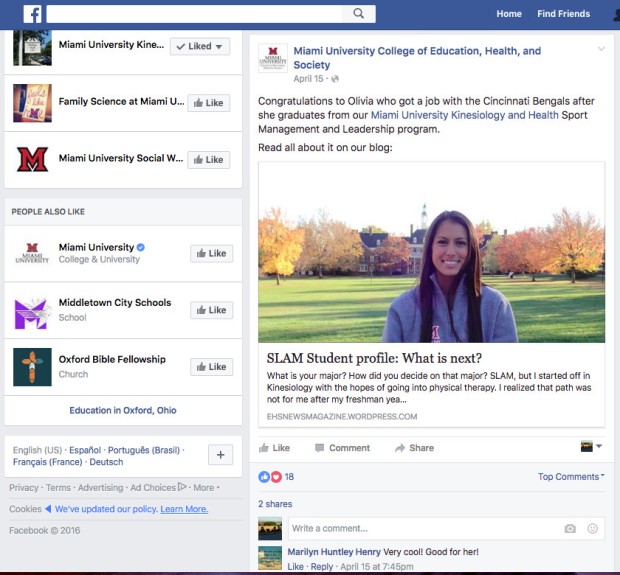
The blog post (below) was written for the College of Education, Health and Society in order to announce the award of a grant to the college. This was an especially challenging post to write because I had to constantly work to find out the details. I was so proud of this article in the end because not only was it reposted by another department on campus, it was disseminated through the University news email. For more about my blog posts, please visit Blogs to Drive Audience post.

Lastly, I included a sampling of screens I designed for the digital display system in McGuffey Hall at Miami University. I talk about these in detail on my Social Media Channels post as well as my Branding post. These became a really important tool in order2015-rahtz-portfolio-email-10 for faculty, staff, and students to communicate internally. These were the announcement boards that I updated them every week. I developed an online submission system where you could submit text and/or graphics by the end of the business day Tuesday and I would work on them on Wednesdays. It was great to be able to see my work on the displays around the hall and know that the information was getting out to the faculty and students on campus. Every so often, I would stand and watch the screens to make sure they were displaying properly and to see if the order of the slides were logical. It was great to see people walk past me and wonder what I was looking at!

So these are the eight projects that I have included in my media portfolio. It’s important to me that I be able to talk about the range of projects I can work on, because I think a versatile worker can be an asset in the workplace. Projects are often times interrelated, so knowing graphic design is just as important as knowing how to write the information, for example. Or, at the very least when you are working on one type of project you can have a knowledgable conversation about a different type of project with your team. As always, if you see anything you like, please contact me on my Contact Page! I’d love to hear from you!

Social Media Channels

As I mentioned in my previous post about blogs, I implemented the idea that each social media channel should be used as a specific broadcast channel, pushing a particular flavor of content on each one. This idea first developed when I worked as a Producer/Director for the eMedia department at UC Blue Ash. With my team of interns, we developed content for the UCTV channel. Our local college tv channel was always in need of content to put in its line-up and it was a great way to get students hands-on experience while still learning the craft of electronic media. A lot of the content came from live recordings of performances held in the theater, but some of them were collaborations with faculty members, like the Cheeto Experiment I worked on:

When I moved on to the College of Education, Health and Society (EHS), I started to envision each “channel” where we communicated with our audiences as a broadcast channel, like channels on a television. Since I was the most familiar with Facebook, I started with that channel. I worked with stats on Facebook and the history of how it was used and determined that most of our audience was alumni. But I knew that current faculty and staff members also peeked in from time to time. I started using Facebook to post informational content that would appeal to alumni and current employees.

ehs-fb-01
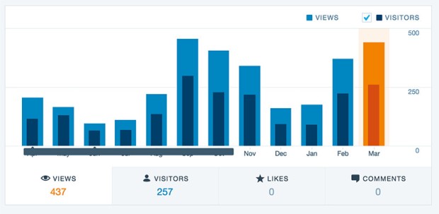
The content varied: articles I found during research about topics that I thought would be interesting to employees in our various departments, blog posts about current or former students (or divisional accomplishments), organic posts about presentations and opportunities offered through the division. Anything that might appeal to that target audience. I also spent some time interacting and commenting on posts by all the schools and businesses in the area as well as popular educational Facebook pages. We saw our audience grow and our stats go up:

2015-2016 FB Likes

I started in July, so you can see it can take a little while to develop an audience, especially organically.

Once I had a handle on the Facebook media channel, I started to grow our Instagram account. This was a bit more dramatic increase, from 37 followers to around 580 followers. Mainly, I did this with free eye candy photographs depicting our division and our university.

2015 Fall EHS IG Poster-e

A sampling of divisional photos posted on the Instagram account.

I did this mostly by connecting with as many people, places, and local businesses as I could. I would follow other college pages, our own university pages, every single local area school district, area business and visitors bureaus–anyone that I thought might be interested in following us. In addition, we gained a lot of photographers and artists as followers. The key audience here were mostly potential students and a some current students. So, for potential students I wanted to show what a beautiful place the division was, what a fun place to be, and an overall great environment. For current students, I was showing activities they were experiencing and hyping up accomplishments experientially.

The next media channel I was to tackle was Twitter. I was unable to really get a good start on this channel, but I envisioned using it as a place where current students could go to get information about current events, deadlines and announcements. I think because of the speed of Twitter and the brevity of the posts, it would be a great place to put reminders, announcements, and other various opportunities.

ehs-2015 12-16 ehs-vision-01
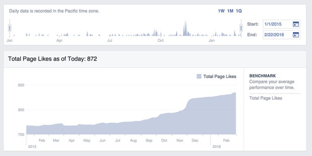
Lastly, I include the digital display system of the division. I’ve mentioned this before in my post about branding, but I didn’t really get a chance to talk about the purpose of that media channel. The digital display system was not being used when I arrived in the division, so I got it up and running and developed a system to make posting images successful. My first goal was to improve morale in the division and increase visual appeal of the items displayed there.

ehs-2016 01-20 ehs-grant-release-01The target audience for the display system was internal employees and current students and sometimes outside audiences. This is where we posted new class opportunities, events, internships, accomplishments, etc.–anything that would be of interest to (a mostly) internal audience.

ehs-2015 12-16 nz-blogger-01I received many compliments from the employees of the division who told me they actually stopped to read what was on the displays and they liked to see what was going on from the slides. I also received positive feedback from employees in other divisions complimenting me on the style and visual appeal of the slides. This was great feedback to get on a seemly small channel of communication!

ehs-2016 01-13 ehs-gradschool-winter-01When using media “channels of communication”, I like to think about the audience that I am targeting through that channel. This not only allows me to organize the information into logical outlets, I can also drive the right audience to the right channel. Instead of pushing out all communications on all channels, I can tailor the content to a specific audience making my communications more effective. The audience will watch and listen to the channel with more attentiveness because the information coming from that channel has a higher probability of being useful and pertinent to them. In this way, I can use these outlets together in a larger more comprehensive campaign instead of it all being one massive data dump.

Blogs to Drive Audience

About four years ago, I started a personal blog. While I was home with the kids I wanted to keep up on my photography and writing skills, so I chose to document the crafty fun things we were doing. (And, I saw all the other crazy cool craft blogs out there so I just had to join in the fun.)

It was a really interesting experiment for me watching what was popular and seeing how I could drive an audience to my blog. At the time, Pinterest was exploding so I was able to gain an audience there pretty quickly. My Cat Condo post blew up pretty much overnight due mostly to Pinterest, which was exciting. I also found a bunch of link parties happening on craft blogs which also gave my links a boost. I tried to send my links out to as many places as I could, like my Ikea Hack Sewing Desk that I posted on the IkeaHackers site, or the Silk Soymilk Box Organizer that was featured in a Facebook post by Silk Soymilk. These were all organic ways I tried to drive people to my blog.

Ultimately, my goal was to drive people to my Etsy Store to buy my photographs and handmade creations. In hindsight, I think I could have organized things on my blog a little differently and created some paid ads (especially on Facebook), but overall I was really satisfied at the audience I gained. A lot of views, a few (ehem-family) subscribers and a little bit of sales on my Etsy website. Not bad for a first time experiment with little financial backing.

When I stepped back out into the working world, I was hired to increase visibility for a local university division. Part of the strategy I came up with was to create media outlets focused on different audiences. This allowed us to slot different content creation into the correct broadcast channels. (I am a huge believer in not posting exactly the same content on all media channels–why would anyone watch any of them if they were all the same thing?) So, I defined our blog as where we posted all the internal divisional accomplishments.

These were meant to be more in-depth articles about experiences our students had in our programs, accomplishments of our faculty and staff, and larger events going on in the division. A lot of times we would push these articles out to other media channels (i.e., Facebook, Twitter, etc.) or they would be picked up by our University News Division. This way, we could keep our Facebook or Twitter descriptions short, but draw in readers to longer more interesting articles.

2016 blog stats-March

Because our blog posts became publicized within larger audiences, our blog viewership rose and our visitor traffic grew larger. Our hope was to drive some of these viewers to our website so they could learn more about our programs and eventually apply to the college.

So, you can see from the two examples above that while creating content is important, creating the “why” behind the content can help accomplish goals (I just read a great article on this from Firebrand Ideas Ignition Blog). In both these examples, a blog was created to help drive traffic towards a website where products were sold. And an increase in viewers means an increase in a potential sale.