Start Small Campaign

The start of a new school year for the Accessibility Network brought the unveiling of a new campaign: Start Small. This is the idea that everyone can start incorporating accessibility techniques into their electronic materials by choosing one small way to begin. First, I updated the website and reorganized its content.

start-small

Next, I designed bookmarks to hand out at new faculty orientation. These, we hoped, would be a good resource on how to “start small” in daily activities. Each bookmark contains five ideas for each category on how to incorporate accessibility into electronic materials.

start-small-bookmarks

Four Bookmarks containing tips on how to incorporate accessibility into electronic materials.

For a larger accessible view, please take a look at the Start Small Bookmarks PDF.

Last, we printed handouts and a large poster of an accessible syllabus.

syllabus-expanded 01

Illustration of techniques on how to make a syllabus accessible.

For a larger accessible view, please reference the accessible syllabus PDF.

These materials were well received when new faculty stopped by our presentation table at the new faculty orientation.

2017-new-faculty-accessibility-01

Accessibility Website Refreshes

The Accessibility Network at UC website has undergone several refreshes while I have been the Communications and Engagement Coordinator. The first iteration was a one-page informational site to get basic information out there about our program. This worked for a while, but we quickly came to realize that our audience (faculty and staff at the university) wanted more than just who we were; they wanted tips and techniques about how to complete accessibility techniques.

The second revamp of the site included just that:

2017 Website Refresh-ex01

Website screen grab illustrating the first refresh of the site, organized based on audience.

As you can see, this was a 5 page microsite, containing info about the program, and resources based on our audience. This also worked for a while, but there were a couple of problems with the organization. First, we had trouble defining what students really needed to know about electronic accessibility. Though the creation of accessible electronic materials impacts them, they are not expected to use any techniques themselves–at least not currently. Organizing the information by audience only exacerbated this problem.

The second was that each resource page–student, faculty and staff–contained the same information on each, with the exception of a minor addition here and there. This resulted in our resource pages existing as very similar sources of information. Additionally, who really was to say that faculty did not need to know about accessibility for websites or that certain staff didn’t need to know about universal design for learning.

Both these downfalls made me want to organize the information in a different way–but how? I set off on a journey researching how other universities (and sometimes government sites) organized their content. I kept a spreadsheet of what I liked about each site and based our new site on everything that stood out to me as being the best.

start-small

The second website refresh, shown here with the second page highlighted. The content is now organized by type of material the audience wishes to remediate.

As you can see from the screen grab above, I decided to organize all content based on what type of material the viewer wished to learn about. This theme is reiterated throughout the site. The main categories down the left-hand side of the page–Electronic Files, Digital Course Content, Websites, and Software/Applications–all lead to a main page about the content and a checklist to include accessibility in that type of file. All pages push the viewer towards the Best Practices, Tutorials or Workshops page through the use of a left-hand callout box. And, as illustrated in the example above, there is ample use of links to more information.

The organization of the microsite now leads the audience to as little or as much information as they wish to investigate. The many links help to tell the story of accessibility in different ways, so the visitor can learn through methods they feel most comfortable. The site pages now follow a more universal design for learning approach and, hopefully, appeals to a broader range of audiences, instead of a select few. This also allows the site to reflect the very techniques the program wishes to see incorporated into all possible electronic materials.

Blogs to Drive Audience

About four years ago, I started a personal blog. While I was home with the kids I wanted to keep up on my photography and writing skills, so I chose to document the crafty fun things we were doing. (And, I saw all the other crazy cool craft blogs out there so I just had to join in the fun.)

It was a really interesting experiment for me watching what was popular and seeing how I could drive an audience to my blog. At the time, Pinterest was exploding so I was able to gain an audience there pretty quickly. My Cat Condo post blew up pretty much overnight due mostly to Pinterest, which was exciting. I also found a bunch of link parties happening on craft blogs which also gave my links a boost. I tried to send my links out to as many places as I could, like my Ikea Hack Sewing Desk that I posted on the IkeaHackers site, or the Silk Soymilk Box Organizer that was featured in a Facebook post by Silk Soymilk. These were all organic ways I tried to drive people to my blog.

Ultimately, my goal was to drive people to my Etsy Store to buy my photographs and handmade creations. In hindsight, I think I could have organized things on my blog a little differently and created some paid ads (especially on Facebook), but overall I was really satisfied at the audience I gained. A lot of views, a few (ehem-family) subscribers and a little bit of sales on my Etsy website. Not bad for a first time experiment with little financial backing.

When I stepped back out into the working world, I was hired to increase visibility for a local university division. Part of the strategy I came up with was to create media outlets focused on different audiences. This allowed us to slot different content creation into the correct broadcast channels. (I am a huge believer in not posting exactly the same content on all media channels–why would anyone watch any of them if they were all the same thing?) So, I defined our blog as where we posted all the internal divisional accomplishments.

These were meant to be more in-depth articles about experiences our students had in our programs, accomplishments of our faculty and staff, and larger events going on in the division. A lot of times we would push these articles out to other media channels (i.e., Facebook, Twitter, etc.) or they would be picked up by our University News Division. This way, we could keep our Facebook or Twitter descriptions short, but draw in readers to longer more interesting articles.

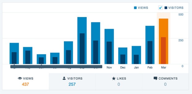
2016 blog stats-March

Because our blog posts became publicized within larger audiences, our blog viewership rose and our visitor traffic grew larger. Our hope was to drive some of these viewers to our website so they could learn more about our programs and eventually apply to the college.

So, you can see from the two examples above that while creating content is important, creating the “why” behind the content can help accomplish goals (I just read a great article on this from Firebrand Ideas Ignition Blog). In both these examples, a blog was created to help drive traffic towards a website where products were sold. And an increase in viewers means an increase in a potential sale.

Project Organization

When I was an intern in the eMedia Department at UC Blue Ash, I developed an instructional manual for bulk film loading. Everyone used film cameras back then for department photography projects, so it was cheaper to buy film in bulk and roll it out ourselves. The problem was, every time there was a new intern, the process had to be taught by word of mouth: there were no reference directions. My manual made it easier to learn the task and created something to look back on if there were questions. (View low-res PDF: film-manual)

This slideshow requires JavaScript.

After several years, I was hired on full time to manage and organize the media projects that ran through the department. I developed an organizational system for all the in-progress projects and their assets so we could keep everything together. After the projects were completed, I designed a system-wide packaging template to label all the archival copies. The final copies were stored in a library and could be immediately recognized as a part of the archives. (View low-res PDF: support-docs-web)

PDQ Support Docs-3

0901012 Graduate Book-1In addition, I chose an online project management tool so team communication could be facilitated. I would assign a project number, enter it into our online project management system (at the time it was Liquid Planner), and fill in a framework of tasks that needed to be completed by the student interns. This way they would know exactly what was expected of them and if they had questions they could clarify.

Lastly, I worked on a comprehensive 50 page manual detailing project-related procedures in the department. It covered everything through pre-production, production, post-production, and project finalization. When it was finished, everyone had a detailed reference to look up how a project was created from conception to completion. Again, this clarified expectations and allowed projects to run more smoothly. (Below is a small excerpt from the manual. View low-res PDF of excerpt: handbook-excerpt)

This slideshow requires JavaScript.

Over the years I’ve learned that doing things in a procedural way allows more flexibility. At first this sounds like a juxtaposition: How can a more defined experience allow for more creativity? I’ve found, though, that once expectations and rules are expressly stated one can move on to the creative portion of his/her work with the framework of the project already in mind. This frees up the process for more creative details to shine through.